I'm staying with today's kick for color entering, for the first time, the ColourQ Challenge!
This week's challenge is #302 and requires the use of Peach Parfait, Bermuda Bay, Hello Honey & So Saffron.
My biggest challenge on this one was to find something that resembled Peach Parfait! That must have been a Stampin' Up in color some time ago but I think I nailed it with PTI's Mellon Berry!
I also stayed with SU's Gorgeous Grunge stamp set! I'm just really feeling the splats and splatters today!
I randomly stamped them using all 4 colors and then added a little "hey!" at the bottom in Bermuda Bay with some cute little enamel dots from MME! ~Love it!
I'll be back soon with even more color yumminess for this beautiful Saturday!
Showing posts with label Color Challenge. Show all posts
Saturday, August 8, 2015
Thinking of You in Colour
I've been absent these past few days but I'm going to make up for it today with several posts...
The first of which is of course my favorite... CAS Colours & Sketches!
This week's challenge, #136, is all about the colors! Blushing Bride, So Saffron and Wisteria Wonder make up this week's combination and they are the only colors (besides white) that I've used to create this card.
I employed Stampin' Up's Gorgeous Grunge stamp set to create the splatters and drips under my white butterfly die cuts, two of which were created in a very heavy vellum bearing a Swiss Dot pattern. The larger piece is SU's Elegant Butterfly while the 2 smaller ones are part of MFT's Hip Clips die set.
Finally, my sentiment is from a PTI Keep It Simple set and stamped in the Wisteria color on a white flag that I've popped up with a bit of foam tape.
I'm really enjoying color challenges and will be taking part in a few more today... ones I've never joined before so stay tuned!
Labels:
Card Challenges,
Card Making,
CAS Colours & Sketches,
Challenge,
Clean and Simple,
Color Challenge,
Crafting,
Die Cutting,
Handmade Cards,
My Favorite Things,
Paper Crafting,
Papertrey Ink,
Stampin' Up!,
Stamping
Location:
Cheyenne, WY, USA
Tuesday, August 4, 2015
Less Is More in Shades of Berry
Good Morning All!
I've just popped in today to share the card I made for the Less Is More Challenge #235: Berry Shades.
I chose Distress inks in Picked Raspberry and Shaded Lilac for my berry shades and inked up a card base made of Stamper's Select cardstock by PTI.
My top panel is made of the same white paper and I die cut a small vine pattern in two corners to let the inking show through. The die is called "Vine" and it's a retired piece by CC Designs.
My sentiment is stamped with PTI's Keep It Simple Thank You in Picked Raspberry and the die cut using the banner die from the Project Life die set.
That's all for me this morning... wishing you all a wonderful day ~ Take Care!
Labels:
Card Challenges,
Card Making,
Challenge,
Clean and Simple,
Color Challenge,
Crafting,
Die Cutting,
Distress Ink,
Handmade Cards,
inking technique,
Less is More,
Paper Crafting,
Papertrey Ink
Location:
Cheyenne, WY, USA
Friday, July 31, 2015
CAS Colours & Sketches ~ Double Header!
Good Morning All! I took a little break yesterday to take my daughter for some Back to School shopping and a little dinner but I'm back today with a new project!
Today's card was created for the CAS Colours & Sketches Challenge #135 The Double!
As it's a 5th Thursday in a month, there's colors and a sketch!
This week's colors are Night of Navy, Wild Wasabi and Daffodil Delight... the sketch is posted below.
I didn't know if I would like these colors together but it turns out that I really do... it's funny the things that you would never have thought of but love in the end!
Supplies Used:
Paper - Daffodil Delight (SU); Marshmallow (BZ)
Ink - Daffodil Delight, Night of Navy & Wild Wasabi (SU)
Stamps - Petite Petals (SU); Modern Leaves (AE) and Frames &; Flowers (dee's)
Other - Glittered Enamel Dots (TPS)
Labels:
Avery Elle,
Card Challenges,
Card Making,
CAS Colours & Sketches,
Clean and Simple,
Color Challenge,
Crafting,
Dee's Artsy Impressions,
Handmade Cards,
Paper Crafting,
Sketch Challenge,
Stampin' Up!,
Stamping
Location:
Cheyenne, WY, USA
Thursday, July 16, 2015
A Colorful Congratulations Guest Design for CAS Colours & Sketches Week 133
Good morning everyone!
I'm back this morning to share with you the card I made for my 3rd week as a guest designer with CAS Colours & Sketches.
This week is a color challenge week that requires the use of Melon Mambo, Early Espresso and Bermuda Bay.
Not long ago I purchased the now retired Stampin' Up set Happy Congratulations on eBay. I love this set! It's so versatile, you can do just about anything with it!
I decided to create a colorful card with the weeks colors starting with stamping the string of paper lanterns and the sentiment in Early Espresso. I then filled in the lanterns stamping in Melon Mambo and Bermuda Bay.
To finish off, I mounted the front panel on a panel of Early Espresso and then all to a white top-folding card base, rounding one corner at the bottom.
I'm loving the way it came out, simple, clean and a wonderful display of this week's colors!
Wishing you all a wonderful Thursday and I can't wait to see what you make!
Monday, July 6, 2015
Just Wanted to Say Hello
Oh gosh... it's Monday again... how did that happen so fast?!
I hope everyone had a wonderful holiday weekend. I spent a lot of it trying to get caught up on things around here and I am happy to report that I was very productive!
One of my "productions" is this morning's card that I made for the Less Is More Challenge Week 231. This week is a color challenge that requires the use of red, white and blue.
I started with a navy blue card base made with Bazzil cardstock in Breaker Bay and added a white panel on top.
My little telephone is from a Papertrey Ink mini set along with the sentiment and is stamped in Lipstick Red by Simon Says, the sentiment in Soft Navy.
And that's all there is to this one... clean, simple, red, white & blue!
Thanks so much for stopping by today!
Thursday, July 2, 2015
Guest Designing with CAS Colours & Sketches
Good Morning everyone! Wow! It's been a while and June flew by like a shot didn't it?!
It's July now though and I have exciting news! I am honored and giddy with excitement to tell you that I am guest designing for the CAS Colours & Sketches blog this month!
Here is my card for this week's challenge #131, using the colors Tempting Turquoise, Rich Razzleberry and Crumb Cake.
I started out with a panel of Stamper's Select White cardstock from which I cut the butterfly shape with Stampin' Up's Butterflies Thinlits dies.
Behind the die negative space I placed a small piece of Irresistibly Yours designer paper in the polka dot pattern that I inked up in the turquoise and raspberry shades.
Over top of this "inked" piece, I placed the intricate die cut butterfly creating a sort of "stained glass" effect for the whole image... I love it!
My sentiment is from the SU set Butterfly Basics and is stamped in Crumb Cake ink for a beautifully soft finish to the card!
Thanks so much for stopping by and if you haven't taken part in the CAS Colours & Sketches challenge to date I encourage you to give it a try today!
Labels:
Card Challenges,
Card Making,
CAS Colours & Sketches,
Clean and Simple,
Color Challenge,
Crafting,
Die Cutting,
emboss resist,
Guest Designing,
Handmade Cards,
inking technique,
Paper Crafting,
Stamping
Location:
Cheyenne, WY, USA
Thursday, June 11, 2015
An Ocean of Love
Hello Everyone! Welcome back to Wyoming this beautiful Thursday morning!
Today's card was made for the Less Is More Challenge Week 227: Colour. This week's color theme is Sunset.
I have a thing for whales... I just think they're neat and I now have 3 stamp sets with a whale theme... this one is by Papertrey Ink!
I'm also enthralled with partial die cutting these days and practicing every chance I get!
My card began with a panel of Aqua Mist cardstock where I planned out my die cutting. I put my whale into place first and cut him out all except for the very bottom.
Next came the circle framelit which I place around the whale and only cut to the stopping point at the bottom of the whale... does that make sense?
Once the die cutting was complete, I marked out the area of my white card base that would show through the opening and sponged my sunset in ink. After that, it was a simple matter of stamping my whale image into place, adding a sentiment a few little hearts, all from the same set, to complete the card!
I LOVE how this one came out!
Thank you all for taking some time to spend with me today, have a great one!
Labels:
Card Challenges,
Card Making,
Clean and Simple,
Color Challenge,
Crafting,
Die Cutting,
Handmade Cards,
Less is More,
Paper Crafting,
Partial Die Cutting,
Stamping
Location:
Cheyenne, WY, USA
Wednesday, June 10, 2015
The Matching Game...
I'm back this fine Wednesday with a card creation for CAS Colours & Sketches #127: Colours.
This week's colors are Mint Macaron, Watermelon Wonder and Tip Top Taupe, new from Stampin' Up just this month... okay well, I don't have those yet... hmmm.
So I broke out my ink swatch book and began the matching game... only it wasn't really matching since I didn't have much but a notion to match to... I think I've done it though!
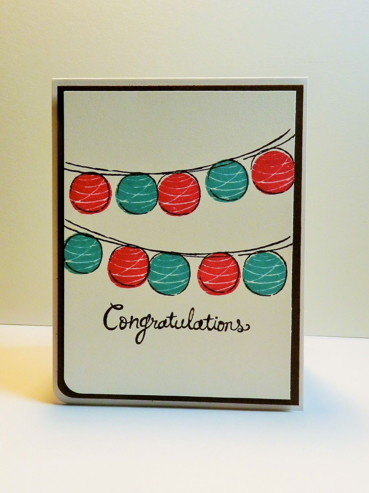
My search turned up 3 Simon Says Stamp colors that worked out wonderfully for this mix; Mint, Hot Lips & Khaki!
The flowers look like 2 different colors, I know, that's because for the first layer, I stamped some color off before I stamped my card. The top layer is full strength and together I think they look pretty "watermelony"... yep, that's a word for today!
Simon's Mint ink is just about the perfect mint so it's very light. That being the case, I decided that the card base and flag layer would be the same Mint cardstock and it sort of brings the ink color out in real life... not so much in the picture though :(
All in all, the colors worked and the simple design keeps it CAS.
Thanks so much for stopping by and have a wonderful day!
Supplies Used:
Paper - Mint (SSS); Stamper's Select White (PTI)
Stamps - Stippled Blossoms (SU); Modern Leaves (AE)
Inks - Mint, Hot Lips & Khaki (SSS)
Dies - Banners Framelits (SU)
Other - Enamel Dots (TPS)
Labels:
Card Challenges,
Card Making,
CAS Colours & Sketches,
Clean and Simple,
Color Challenge,
Crafting,
Die Cutting,
Handmade Cards,
Paper Crafting,
Stamping
Location:
Cheyenne, WY, USA
Tuesday, May 26, 2015
Thank You Love ~
Hello and Welcome back to Wyoming!
This morning's card has been created for the CAS Colours & Sketches Challenge #125. This one is a color challenge that requires the use of Crushed Curry, Elegant Eggplant and Garden Green.
I started with a green base panel. Not having any Garden Green cardstock, I substituted Green Apple by Simon Says.
I used my favorite embossing folder in a Swiss Dot pattern to texture the majority of the panel and then stamped my sentiment in VersaMark and embossed it in white.
The butterflies were stamped in Elegant Eggplant ink and then punched out along with some smaller butterflies in vellum that I also put through the Swiss Dots folder. I then finished them off with an itty-bitty Crushed Curry heart and a single tiny gemstone!
I'm pretty sure I've seen this design before so I'm going to call this a CASE... I'm just not sure who I'm CASE'ing :)
Thanks so much for stopping by and spending some time with me today... if you would like to see more of my cards be sure to follow my blog so you don't miss anything :)
Supplies Used:
Paper - Whisper White (SU); Green Apple (SSS); Vellum (TPS); Harvest Gold (PTI)
Stamps - Papillon Potpourri and Another Thank You (SU)
Ink - VersaMark; Elegant Eggplant (SU)
Punches - Elegant & Bitty Butterflies & Confetti Hearts (SU)
Other - Cuttlebug Swiss Dots Embossing Folder; Hero Arts White Embossing Powder
Stampin' Up Basic Rhinestones
Labels:
Card Challenges,
Card Making,
CAS Colours & Sketches,
Clean and Simple,
Color Challenge,
Crafting,
Die Cutting,
Embossing,
Handmade Cards,
Paper Crafting,
Stamping
Location:
Cheyenne, WY, USA
Sunday, May 17, 2015
Thinking of You on A Windy Sunday Morning...
Good Morning Friends! It's Sunday and a little windy and cold here in Wyoming... Oh where is spring?!
Today's card was created with a couple if challenges in mind...
First, the lay-out for the card comes from this week's Freshly Made Sketches #186. I love the look of split front cards and they're not near as hard to make as I thought they might be.
Second, the color scheme comes from this week's challenge at Sunday Stamps #101 that included a Dark Grey, Medium Gray, Light Blue and Teal. I'm not sure I chose the lighter blue well but I think it works in any case.
My sentiment is from one of my favorites, PTI and their Keep It Simple sentiment mini sets.
Thanks so much for sharing a few minutes of your Sunday with me and have a great day!
Supplies Used:
Paper - Bazzil Tropical Breeze; Smokey Shadow & Soft Stone (PTI); Whisper White (SU)
Dies & Punches- A2 Card Curved Edge Die (SSS); Petite Petals Punch (SU)
Stamps - Petite Petals (SU); Keep It Simple: Thinking of You (PTI)
Inks - VersaMark; Teal (SSS)
Other - White Embossing Powder (HA); Basic Rhinestones (SU)
Labels:
Card Challenges,
Card Making,
Color Challenge,
Crafting,
Die Cutting,
Embossing,
Freshly Made Sketches,
Handmade Cards,
Paper Crafting,
Sketch Challenge,
Stamping,
Sunday Stamps
Location:
Cheyenne, WY, USA
Saturday, May 9, 2015
This Little Owl Says Love You!
I started out making this card for AAA Cards Game #38, A Hole In My Card... and then it struck me that the colors required for CAS Colours & Sketches #123 were just perfect for the design in Sahara Sand, Soft Suede & Tangerine Tango!
My idea was to have a little owl peaking out from his front door in a tree. I don't have any tree stamps that are "card" sized so I used the Hardwood background stamp by SU to create my tree.
My owl is from the PTI set called Polka Dot Parade #11 and he thankfully has matching dies to cut him out.
My sentiment is a combination of the owl's belly and a die-cut "you" from Stampin' Up's Hello You Thinlits set.
I like how the card turned out overall... I wish though that I had had that tree stamp I was trying to create... I'm not completely happy with the way that part looks.
Thanks for stopping by, hopefully it's not cold and snowing where you are today :)
Supplies Used:
Paper - Classic Kraft, Stamper's Select White, Orange Zest & Fine Linen (PTI)
Ink - Tangerine Tango, Soft Suede & Sahara Sand (SU)
Stamps - Hardwood Background (SU); Polka Dot Parade #11 (PTI)
Dies - Sizzix Circle Framelits; Top Dog Dies Stitched Borders; Polka Dot Parade #11 (PTI); Hello You (SU)
Wednesday, May 6, 2015
Missing You...
The lack of the aforementioned is however likely to be what inspired my color choice for CAS on Sunday Challenge #57, White with one other color... I chose bright orange.
I used a Triplit set by Sizzix and Stephanie Barnard to cut out my flower shapes and then did some inlaid die cuts.
Once that piece was finished, I textured the whole panel in an embossing folder and added my sentiment on a little banner at the bottom.
All White and Orange Zest... now, where is that sunshine?
Supplies Used:
Paper - Neenah Solar White; Orange Zest (PTI)
Stamps - Filliable Frames #2 (PTI)
Inks - Orange Zest (PTI)
Dies - Sizzix Triplits Flower #2
Other - Argyle Embossing Folder (SU)
Tuesday, May 5, 2015
A Rocky Mountain Thank You
Hello again... I bet you're wondering what this card has to do with the Rocky Mountains... the Broncos of course!
Actually, I made this card for the Less Is More Challenge #222, Colour. The challenge was to choose colors across from each other on the color wheel and I chose blue and orange.
The colors are actually Tempting Turquoise and Pumpkin Pie by Stampin' Up and they go just perfectly together!
I kept the design very simple for this one... it's a CASE of another card I made that I'm pretty sure was a CASE of one I saw on Pinterest... once you start looking at all the wonderful cards out there it can get a little blurry where you saw what!
That's going to do it for me today, thank you all so much for visiting once again. Enjoy your evening and take the rest of the night off!
Supplies Used:
Paper - Stamper's Select White (PTI)
Inks - Tempting Turquoise & Pumpkin Pie (SU)
Stamps - Flower image by Hero Arts; Forever Fall Sentiment by Reverse Confetti; Papillon Potpourri (SU)
Other - Elegant Butterfly Punch (SU); White Pearls (HA)
Monday, May 4, 2015
Wishing You A Lovely Day
Good morning! It's amazing how fast a week can fly by isn't it? And I have been sadly absent...
I'm back now though and with a new card for not one but two challenges!
This card was made for CAS Colours & Sketches #122 The Double. This was a double challenge requiring both certain colors and a sketch!
I created my wavy lines with a solid stripe stamp made of polymer that I mounted on my stamp press in a wavy pattern. This wave was stamped in the 3 required colors; Calypso Coral, Island Indigo & Wisteria Wonder.
Next I used a Szzix & Hero Arts stamp and die set to create my little dragonflies in all 3 colors and mount them along the wave.
Lastly, the sentiment is from a mini stamp set by PTI called Signature Series: Butterfly.
As I was looking at my finished card it occurred to me that it was also a wonderful entry for CASology's Week #144: Flight and that is the second challenge this card will be entered into!
Thanks so much for stopping by and have a great Monday!
Supplies Used:
Paper - White Cardstock (HL)
Inks - Calypso Coral, Island Indigo & Wisteria Wonder (SU)
Stamps & Dies - Background Basics: Superstripes & Signature Series: Butterfly (PTI); Sizzix & Hero Arts Stamp & Die Sets #657774
Labels:
Card Challenges,
Card Making,
CAS Colours & Sketches,
CASology,
Clean and Simple,
Color Challenge,
Crafting,
Die Cutting,
Handmade Cards,
Paper Crafting,
Sketch Challenge,
Stamping
Location:
Cheyenne, WY, USA
Saturday, April 25, 2015
Color Outside The Lines with Live Love Cards
Two posts in one day... this is what happens when you're sick and you get off track!
In any case, I recently joined a card making community called Live Love Cards. It was created by a gal named Darlene DeVries who's videos and blog I've followed for quite some time. So when the site became available it was a no-brainer to join up.
The card above was made for the member challenge for the month of April with the theme Rainbows. I know it's a sort of scattered rainbow but I like the overall effect and the splotches and splatters here and there fit the sentiment perfectly!
If you're looking for a cool place to hang out, a place to learn some cool stuff and see some new products in action you should definately check out Love Love Cards. Membership costs only $2.50 a month and earns you some pretty awesome access... right now my name is in the pool to win a Misti!
Supplies Used:
Paper - Black & White Cardstock
Stamps - Stampendous Color Outside, Stampin' Up Gorgeous Grunge
Inks - Simon Says Schoolhouse Red, Orange Peel, Sunshine, Green Leaf, Caribbean Blue & Hydrangea; Versafine Onyx Black
Other - The Paper Studio Enamel Dots
Papertrey Ink April 2015 Blog Hop!
Good Saturday Morning to You!
Today's card was made for Papertrey Ink's monthly blog hop for April 2015!
Our inspiration photo is posted below but basically we were to design a card with the theme of pinks and reds mixed with navy blue, a hot color trend for Spring this year.
I created my background using the Super Stripes stamp set and Enchanted Evening ink.
I'll bet you recognize these flowers too... Yes! The Sweet Life! One of my absolute, all time favorite stamp sets, on the planet!
To finish off my card I added some Liquid Platinum embossing powder on the sentiment and of course, a few Sparkling Clear sequins by Pretty Pink Posh.
Thanks so much for hopping with us today and I'll see you tomorrow with a veritable cornucopia of cards I've made recently for various challenges around the web!
Supplies Used:
Paper - Stamper's Select White Cardstock
Stamps - Background Basics: Super Stripes, The Sweet Life
Dies - The Sweet Life
Inks - Enchanted Evening, Sweet Blush, Hibiscus Burst, Raspberry Fizz, Spring Moss, New Leaf, Simply Chartreuse & Ripe Avocado; VersaMark
Other - Ranger Liquid Platinum Embossing Powder, Glossy Accents, Sparkling Clear Sequins by Pretty Pink Posh
Labels:
Blog Hop Challenge,
Card Challenges,
Card Making,
Color Challenge,
Craft Supplies,
Crafting,
Die Cutting,
Embossing,
Handmade Cards,
Paper Crafting,
Papertrey Ink,
Stamp Sets,
Stamping
Location:
Cheyenne, WY, USA
Tuesday, April 21, 2015
A Simple Thank You
I have been so sick this last week that I've gotten behind on my card making as well as other things. I did not however want to miss posting for today but it's going to be short and sweet!
Introducing my card for CAS Colours & Sketches #120 Colour Challenge.
We were challenged to use only 3 colors, in this case Perfect Plum, Coastal Cabana and Rose Red.
Having a head cold and trying to come up with a new design was just too much for me this week! So this card is a case of one I found on Pinterest and really liked.
Right now I'm off to take some decongestants and gear up for another day at the office ~ See you soon.
Supplies Used:
Stamper's Select White Cardstock (PTI)
Gorgeous Grunge Stamp Set (SU)
Keep It Simple Thank You Stamp Set (PTI)
Perfect Plum Ink (SU)
Coastal Cabana Ink (SU)
Rose Red Ink (SU)
Saturday, April 18, 2015
A Golden Greeting
Presenting my "GOLD" card for the CAS on Sunday Challenge #56 Gold.
There's not a lick of stamping in this one but the Cuttlebug got a work out!
I started with a plain white base card and then added a layer of DCWV Gold metallic cardstock, followed by another white layer that was dry embossed with SU's Decorative Dots folder.
Enter The Stamps Life "hello" die set... I like Stephanie Barnard's word dies because they all have that nifty little shadow piece in the back. There are 2 separate pieces so you can use it with or without the shadow ~ Love it!
The shadow was cut from the same metallic paper while the hello was done in gold glittered paper by The Paper Studio.
Very simple, lots of white space ~ It's a CAS winner!
Supplies Used:
Paper - Stamper's Select White (PTI); Gold Metallic (DCWV), Gold Glitter (TPS)
Dies - Bicycle Club Die Set (TSoL)
Other - Decorative Dots Embossing Folder (SU)
Labels:
Card Challenges,
Card Making,
CAS on Sunday,
Clean and Simple,
Color Challenge,
Crafting,
Die Cutting,
Die Sets,
Embossing,
Handmade Cards,
Paper Crafting
Location:
Cheyenne, WY, USA
Saturday, April 11, 2015
Birthday Wishes in Ombre
It's Saturday once again and I have to tell you, I'm very happy about that! What a week!
This afternoon I'm sharing the card I made for Papertrey Ink's Make It Monday Challenge #208: Ombre Stamping and I'm happy to report I did not cheat!
In the video tutorial a Misti stamping tool was used to repeatedly stamp the image, exactly so, until the colors and effect were just perfect. I have not purchased a Misti just yet... I want to but, haven't yet so my first thought was to ink the paper and then die cut... I didn't though!
I just played around with inking tools, makeup sponges and even my fingers until I got the stamped images I wanted and then cut them out with the matching dies.
The stamp set I used, Birthday Style by PTI, provided all of the other elements that brought this card together!
Supplies Used:
Paper - Stamper's Select White & Raspberry Fizz Cardstock (PTI)
Stamps & Dies - Birthday Style (PTI)
Inks - Tropical Teal, Hawaiian Shores, Aqua Mist, Raspberry Fizz, Hibiscus Burst & Sweet Blush (PTI); Versafine Onyx Black; VersaMark
Other - Black Thread, Sequins by Pretty Pink Posh
Subscribe to:
Posts (Atom)